Challenge Overview
Challenge Overview
The goal of this challenge is to add improvements and new pages to existing express.js web application that communicate with DataBus REST API and draw charts using google charts.
Challenge Requirements
You are provided with an express.js web application that is using the following technology/frameworks :
-
Web application will be built using Express.JS, and HTML5 with AngularJS/Bootstrap UI.
-
We are using google charts to render charts in frontend.
-
Databus REST API to retrieve data to render as google charts.
-
Apache web server will be used as reverse proxy for the web application.
-
MongoDB for persisting user data, and any other required data.
Ubuntu AWS VM
We have Ubuntu AWS VM Image that has the application/databus deployed to it, it’s dependencies, and apache server.
You can request a VM in the challenge forums, or you can ask to share the AWS Image with your AWS account, or you can follow the provided deployment document to deploy to your own local ubuntu machine.
Required Pages
We are implementing the following UI elements/pages in this challenge :
Navigation
-
We will have a consolidated navigation in logged in views/pages.
-
The navigation between these pages should be at the header of the page.
-
Welcome {Username} should be added to header with “logout” link, it will be “Welcome {username} | Logout”.
-
There are four pages to navigate between :
-
User management page (admin only)
-
Dashboard
-
Detailed Usage
-
Monthly Report
-
Login Page
Already exist in current application.
User Management Page
-
If a user is flagged as an admin (a boolean value on the user object) they will have access to User Management Page. This is a simple CRUD page to list the users, and add/edit/delete them.
-
Properties on a user are:
-
Company Name
-
First Name
-
Last Name
-
Title
-
Email (used for both portal login and DataBus connection)
-
Password (frontend login)
-
APIKey (DataBus connection)
-
Address, city, state, zipcode
-
Tariff (string)
-
Utility Name (string)
-
-
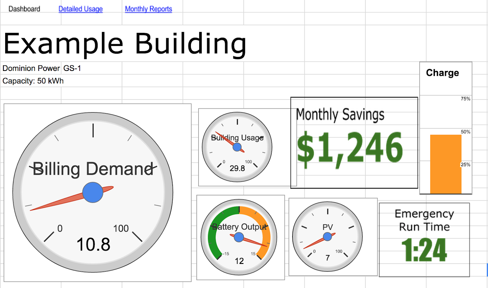
Dashboard Page
-
This is the current dashboard page after user login, and will be updated as follow.
-
The content and UI look and feel of the page should look like this with following notes :
-
We want to match layout and size of the elements (graph, gauges, numbers)
-
Some graphic elements need to be updated :
-
“Charge” plot could be shown with a battery icon, rather than a bar chart, we can use overlay in this case :
-
“Emergency run time” can be shown as a digital clock
-
overlays should be used where needed.
-
-
The boundaries of gauges are shown in screenshot above. You can also refer to Example_Dashboard shared in forums for more information about charts.
-
-
For detailed information about the elements displayed in the page refer to Dashboard sheet in DataProductsList document, note the following :
-
The chart at the bottom of the page will be a Stacking area zoomable chart that will have historic data view represented by the “zoom” option. Refer to this chart for example of the zoom feature, user can either click on zoom links (1d, 1m, 1y, All .etc) or can use dragging at the bottom the chart, this dragging feature is experimental in google charts but we need to use it here. Also user can (de)select (hide/show) areas.
-
-
If viewing 4 days or more of data at a time, the chart needs to simplify the data. Each individual data point should now show more than 1 minute worth of data (similar to how the chart on google finance behaves)
-
If viewing > 4 days but < 3 months, each data point should reflect 1 day worth of data.
-
If viewing >3 months, each data point should reflect 1 month.
-
The same aggregating procedure can be used to aggregate 1 day or 1 month worth of data.
-
-
To aggregate data and find the values to be plotted, use the following steps
-
Find the maximum building usage over n minutes that occurred during the period to be aggregated.
-
For example, if n is 15 minutes and each data point reflects 1 day (as above) the correct value is the highest 15 minutes over that day.
-
-
For that same n minute time period, plot the average billing demand, storage discharge, and pv production.
-
For example, say the highest 15 minutes of usage occurred during 5:00-5:15 pm during 9/4/2014. The correct values to plot for 9/4/2014 would be the average storage power discharge, PV production, and billing demand all during that 5:00-5:15pm time period.
-
-
Use of the Databus methods rollup and dynamic aggregation may be useful for this process.
-
-


Detailed Usage
-
This page will display same Stacked Area with Zooming chart as the one in the dashboard page (above).
-
This page will display the detailed power usage
-
Google Area Chart with stacking, zooming, and dragging features will be used here, note the following :
-
User can select to hide/show areas
-
User can zoom the chart data to set the historic data start date : 1 day, 1 week, 1 month, 1 year, or by picking a custom date from date picker
-
User can drag to zoom in/out
-
-
The chart will display 4 time series data :
-
Billing Usage
-
Storage Discharging
-
PV Production
-
Storage Charting
-
Billing Demand
-
-
Refer to Dashboard sheet in the excel sheet (DataProductsList document), this chart is using same time series data displayed in dashboard :
-
Building Usage --> usage column
-
Storage Discharging --> negative values of cs
-
PV production --> pv_production
-
Storage Charging --> positive values of cs
-
Billing demand → billing_demand
-
Monthly Report Page
-
This page display the monthly report statistics
-
Refer to Monthly Report sheet in (DataProductsList document) for more details about the information to be displayed
-
The data will be retrieved from Databus relation table.
-
User will use drop down list to select the monthly report to view.
-
by default it will display current month.

Creating Databus tables
In each sheet in DataProductsList.xlsx file there are timeseries column and relational column :
-
Each cell of timeseries column will contain the timeseries table name to be used (also represents the label to be used in chart, and the column name in timeseries table), each of these tables will have 2 columns: 1 for the time stamp (a Unix-like timestamp in milliseconds, provided by uts in the sample file) and 1 for the actual value (this is the cell value in the timeseries column in the excel sheet).
-
table name should be in this format {Prefix}{name-from-xlsx} i.e. topcodersoc (where prefix is ‘topcoder’ and table-name-from-xlsx is ‘soc’), the prefix will be stored in the user model.
-
The reason we need a prefix because DataBus does not allow duplicate table names across databases, so we need a unique name for each user, so a prefix is proper method for that.
-
-
-
Each cell of Relational column will contain the table name and the table field name to retrieve information from.
This page document how to create database via UserInterface, and creating tables via API http://buffalosw.com/wiki/provisioning-databus-2/ (you cannot create a table via User Interface)
Frontend and Backend Update
-
For each timeseries table there should be updating in real time (refer to the excel sheet for corresponding chart/element) you will create a job for it with following note :
-
Job backend will keep pulling data from databus periodically (i.e. every 5 seconds).
-
If there is new data, it will emit it to the socket.io server.
-
-
Also for notifications we also need to support updating in real time. You will simulate the notification functionality.
-
Write simple socket.io server to push new data from jobs to frontend.
-
frontend will establish connection on successful login.
-
all jobs will emit to socket the new data.
-
the socket will emit to frontend the data.
-
exactly there should be one socket connect for each client that push all jobs data.
-
-
Update frontend JS to remove the interval to pull data for charts from backend.
-
Write new controller to serve the new pages.
Sample Data Upload Script
-
Provided in challenge forums an excel document with sample data for each section. You will use it to create sample data.
-
The sample data for testing should be created as a csv file.
-
Write a command line script that upload the sample data that can run as cron job to generate random data and upload it to the DataBus API.
-
this is important so we can show a realtime update in the frontend charts.
-
the script will run as background cron job.
-
Apache Server
-
The application will be accessed through apache.
Configuration and environment variables
-
All sensitive information should be placed in environment variables.
-
Configuration will include
-
routes
-
MongoDB connection information.
-
.. other configuration as needed.
-
Documents
Provided in challenge forums :
-
Sample google excel sheet file with google charts
-
Data Products List excel file
- Existing express.js web application
Final Submission Guidelines
Deliverable
-
All source code and configurations that addressed the requirement above.
- README deployment document.